Little Five Points
RWD Design

Timeline: March - April 2021
Team:
Alyssa Terry - UX/UI Designer
Micah Stokes - UX/UI Designer
Sydney Hembree - UX/UI Designer
Project Type:
UX/UI/Responsive
Web Design
My Role: User Research, Sketches, Wireframing, & Prototyping
Tools: Figma, InVision, Trello, Slack, Adobe Creative Suite, Google Drive, Miro
Little Five Points Center for Arts & Community, better known as either L5PCAC or The Center, is a non profit center that resides within Atlanta’s Little Five Points community. Their main objective is to house local nonprofits and assist in their long-term growth; their website was designed to provide information about the community, rental services within their facilities, and tenant partnerships. However, the website has not been maintained in places, resulting in a lack of clarity that confuses and overwhelmes users. Using UX/UI design principles, the team was able to improve the website with the goal of driving repeat site visits, as well as clarifying the donation process. Ultimately, the overarching goal of The Center is to enhance development of quality tenants.
User Research, Competitive Analysis, User Pain Points
Research Data Analysis, User Persona
User Flow, Card Sorting
Sketches, Lo-Fidelity Wireframes
User Testing, Iterations
Style Guide, High-Fidelity Prototype
Each team member had family and friends look over the current website to determine features that needed updating; these users found the navigation to be cluttered with outdated information lining the pages, an odd color scheme, and private information on the organization's public calendar. Our point of contact at the nonprofit kindly sent us updated information not found on the site, as well as multimedia links to incorporate into the mobile and desktop prototypes. We researched the area of Little Five Points and found inspiration that later helped shape the new logo, typography, and color selection.
“It's like an edgy teenagers, early 2000s, website on the dark web. But in terms of usability, [pieces of the website are] not just useless, but actually kind of adorable in how useless they are.”
"[The website] looks like somebody who was like, 'yeah, I can design a web page', so it just looks very basic; not anything that I would definitely be wowed by by any means."
"The current website that we have, the L5PCC.org, is not really reflective of our brand. We [also] wanted to kind of pick up traffic and so, I feel like our website is really sending a mixed signal or mixed message."
"There are too many menu options, the videos are very small to see properly, and why are there pictures of logos everywhere?"
We looked at other companies nearby that would rent out space or offer events to the public, including theatre companies (Horizon Theatre) and other community centers (Cabbagetown & Alpharetta). Of course, the Horizon Theatre Company is located onsite and is a tenant partner, but we only learned that with digging. The other centers had similar amenities (seating, parking, wifi), with outdoor areas to host sporting events and camps.


With our research in hand, we narrowed down features to add. Our key takeaways included enhancing the website's calendar to incorporate events and programs, adding pages to showcase current and past events, offering an online rental form for users to book available spaces in the building, revamping the logo, and building out a secure intranet space for partners to communicate important information.
During user interviews and surveys, we found that prospective tenants were looking for a space to rent with more amenities, parking, and activities to engage children during the event in question. Therefore, we believe that the community center’s website needs a clearer picture of what they have to offer clients. We felt that we were able to help by organizing their navigation, updating both their brand and the website itself to reflect an fresh post-pandemic look, and simplifying the graphics and interactive elements. We accomplished this by investigating and reflecting client-based needs with stakeholders, researching local competition for insight, and incorporating long-term business goals into the design to reflect KPIs. Doing this allowed our product to stand out against the competition and improve rental revenue for The Center.

Our user persona, named LaQueesha Brian, is a middle-aged woman with a growing family. She is a local fitness instructor who is searching for a space to rent to host classes. She is gravitating towards the Little Five Points Center because of what it has to offer, specifically in terms of the amenities, affordable prices, and location.
Currently, users have to hunt for events, information about reserving event spaces, maintenance request forms for partners, and so on. We propose that users like LaQueesha be able to navigate from the homepage to an any section of the site in less than three steps, thereby making the website more user-friendly. Users would, in our scenario, follow the calendar or the navigation bar to rent out a space using an online form, which would streamline the process for the Center as well.


We began the process of card-sorting, establishing a user flow, and building out a site map. We decided to consolidate the website navigation into fewer sub-pages, created a back-end for partners and the Board of Directors, and updated navigation titles. For example, we changed "Donate" to "Support Us" because the website had language explaining how donations are used to support the nonprofit; therefore the navigation should emphasize it.


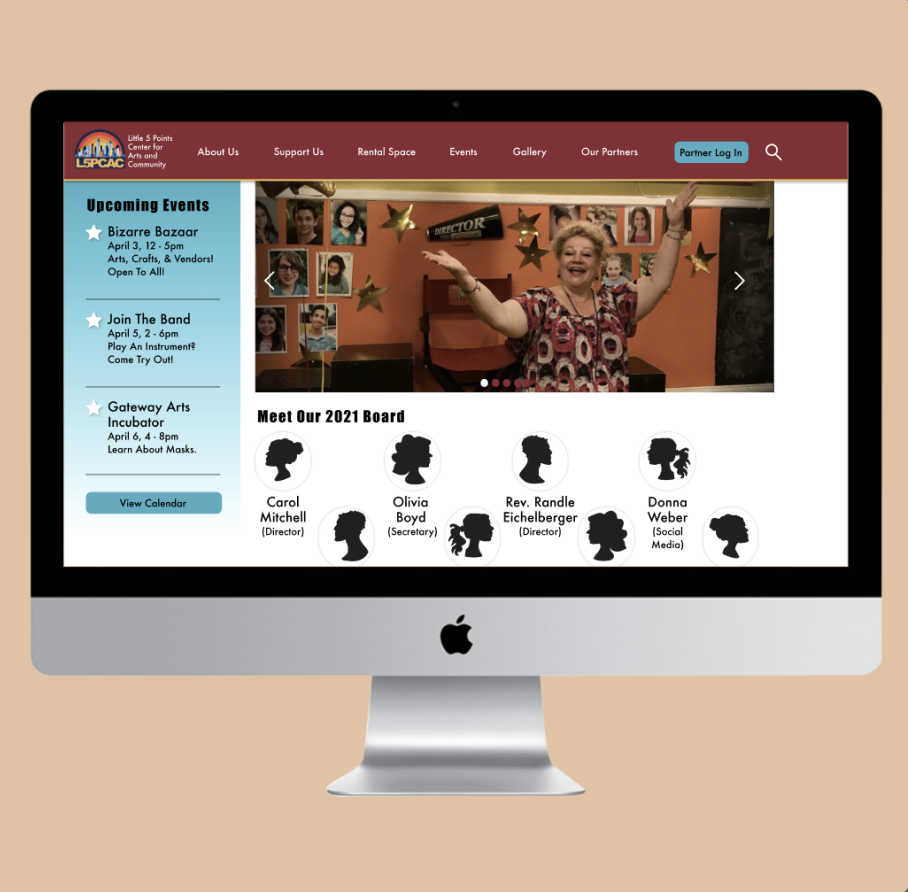
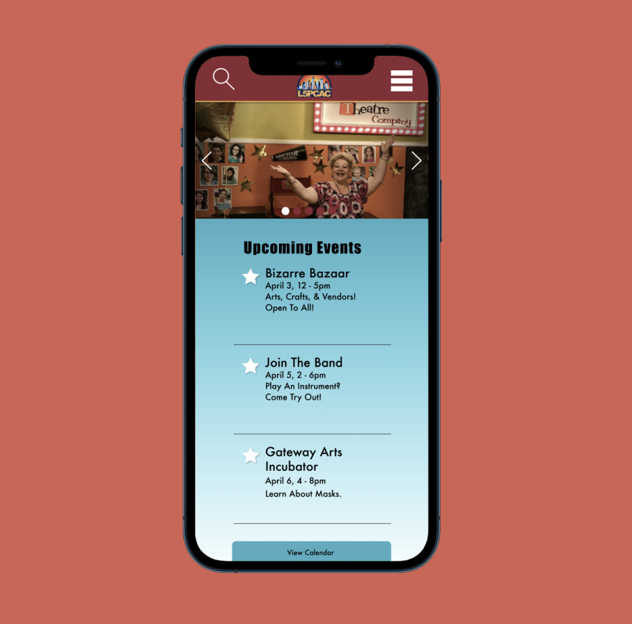
We each sketched out ideas of how the homepage should be laid out, highlighting the new logo, the partners and tenant-partners of L5PCAC, and all the amenities the center offered to the public. Little Five Points also expressed an interest in what they wanted to keep, which included a donation page, an events page, a history/about us page, and a private partner section of the site. These ideas culminated into a new navigation system, built for desktop and Android devices.


From our initial sketches, we combined ideas. The team wanted to resize and make the site’s calendar interactive to users and partners. We all thought a carousel on the homepage would welcome visitors and introduce upcoming events. There needed to be a partner page, as partners and tenant-partners make up this nonprofit's mission. Finally, as the Center is using social platforms like Facebook heavily, having a Facebook feed made sense.


Our team conducted three rounds of user testing, including an A/B test, to improve the website's features. We met with five individuals and had them perform three tasks, which were to donate $5.00 to the organization, submit an event rental request form, and log in to the partner homepage. Of the three tasks given, submitting an event and logging on to the partner page gave users trouble because of how we organized the navigation. This observation was quickly addressed and further testing confirmed we had fixed the problem.

“I like that there’s a behind the wall section [for partners]. I like being able to see where my money is going for nonprofits, so the ‘Support Page’ is good.”

“Rental’ threw me at first. I didn’t know whether to go to ‘Events’ or ‘Rental’. [...] Altogether, the color scheme and navigation are broken up well.”

"I think if you change 'Partners' to 'Our Partners' and move it right beside [the 'Partner Log In'], people will find it faster.”
We gained a lot of great feedback through user testing and, with those suggestions, we remove the calendar from the homepage and used the space to highlight upcoming events instead. We expanded the size of a calendar on the events and partner sub-pages. As stated previously, users tripped up with our navigation, so we went back to the drawing board, renaming 'Partners' to 'Our Partners' and 'Rental' to 'Rental Space', along with shuffling the navbar's tabs to make it more intuitive.


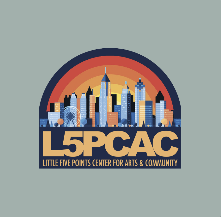
When brainstorming ideas for the Center's brand, we decided to incorporate pieces of the Little Five Points community as the organization is community-centered; for example, the colors in the new logo are from murals found around Little Five Points, five-pointed stars are used instead of bullet points, and five pictures are included in each carousel. The logo uses “Impact” for its typography as it reminded us of the lettering found on murals as well. The navigation uses paint strokes on hover to subtly suggest the artistic flair of the nonprofit.


During our final iterations, we added in the color scheme based off of graffiti around the Little Five Points area. The logo, which used elements that we all brought to the table, helped tie the brand together.
Users navigate to the events page through either the 'View Calendar' button on the homepage or with the navigation menu. While there, they can interact with an event list and an interactive calendar to RSVP for events.
To donate, users can click on the 'Support Us' tab and scroll to the donate form, where they can offer an amount of their choosing. Ideally, their payments would be processed through a third-party site and they would receive a notification.
If users wished to submit a rental request form, they would click on the 'Rental Space' tab, where they would find all important information about the process and costs of renting out a space. The request form is also located here as an interactive PDF.
Tenant-partners and partners now have a separate space for important confidential information, namely maintenance request forms, their contracts, the Board of Directors' meetings, and how they wish to be portrayed on the website's public partnership subpage.
In summary, our team set out to update and reorganize the L5PCAC website to be user-friendly, with a modern look to match the update. Upon finishing the final iterations, we reached back out to the nonprofit for feedback; the organization has taken an interest in the design and, with connections on our end, is recreating it through Wordpress with the help of a web developer. We have since gathered the information he needs in order to build and maintain the pages. We look forward to keeping in touch and assisting where needed.

Amidst the pandemic, Georgians lacked substantial information on where COVID-19 vaccines were being offered. This app was designed to encourage vaccine registration.

A 2020 Florida startup, Streams of Sound is taking handpan music to healthcare facilities to promote healing. However, the nonprofit needs a helping hand to get its branding on par to its mission.