Streams of Sound
UX/UI/Front-End Development Design

Timeline: May - June 2021
Team:
John Hand - UX/UI Designer
Nia Terry - UX/UI Designer
Sabrina Slater - UX/UI Designer
Sydney Hembree - UX/UI Designer
Project Type: UX/UI/Front-End Development Design
My Role: User Research, S.W.O.T. Analysis, Wireframing, Prototyping, Coding, Heatmap Analysis
Tools: Figma, InVision, Trello, Slack, Adobe Creative Suite, Google Drive, Miro
A small startup located in Jacksonville, Florida, Streams of Sound Inc. was founded in early 2020 and, despite the pandemic, it has grown exponentially. Its mission is to simultaneously introduce and educate the public about the handpan, a musical instrument similar to a steel drum. Local handpan artists work with the non profit to bring handpan music into health and care facilities, such as the University of Florida's Health Proton Therapy Institute, in an effort to promote healing and wellness. However, since its founding, the organization wants to improve donor support and encourage new artists to join. This team is dedicated to incorporating elements that will enhance the Streams of Sound existing website. How might we improve usability to attract donors and artists alike?
User Research, Competitive Analysis, User Pain Points
Research Data Analysis, User Persona
User Flow, Card Sorting
Sketches, Lo-Fidelity Wireframes
User Testing, Iterations
Style Guide, High-Fidelity Prototype, Front-End Development
Our team tested the current website by asking others to perform three tasks: 1) learn about the handpan, 2) donate to the cause, and 3) apply to perform with the organization. We discovered that most users wanted more information before completing each task, such as describing what a handpan actually is. Furthermore, they asked for a streamlined experience when navigating the site, with more obvious Call To Action buttons, optional music streaming, and better UI aesthetics to improve accessibility. We also created an anonymous survey to see what music people were most receptive to in stressful situations, to understand their donation habits, and to determine if people knew anything about music therapy and the handpan. Those who responded reported that they like soothing tones while under pressure. They do not donate to causes out of a lack of trust with the organization and they know very little about music therapy.
“I'd like the website to be reorganized so I don't have to search the entire site. Knowing more about the organization as a whole would also help build trust.”
"Seeing a history of the handpan on the site would be interesting; also, I'd like to know how to volunteer in some capacity and the process in doing so."
"I would donate more if I understood how the money is being used by the organization. Aside from that, the logo is great, I like the water pictures, and the font is big and easy to read."
"We’ve had exponential growth and interest in what we’re doing over the past several months; we plan on expanding into different locations. It seems like the timing is right."
We focused our attention on musically-inclined non profits to compare our product to, including two specific to the handpan (Handpan Community United and the Healing Handpan Alliance) and three specific to bringing music to underserved communities (Musicians On Call, The Gift of Music Foundation, and the We Are All Music Foundation). Overall, both the direct and indirect competitors had more information on each organization, better CTAs, good visuals, and personal testimonials.


Most users we talked to mentioned feeling confused while navigating the site, partially because of the general lack of information about the organization and the need for more functionality, such as with the limited donation options on the current site. With this in mind, we focused our attention on expanding the current site for the simplicity of the Streams of Sound staff.
Our survey results, user and stakeholder interviews, and competitive analysis prompted us to design four pages to improve the Streams of Sound site: 1) an 'About Us' page to discuss the history of the handpan and explain more about the organization and its mission, 2) a "Join Us" page for artists to get involved and become part of the team, 3) a "Donate" page for donors to support the organization, and 4) a new homepage to showcase elements of the previous three pages with CTAs to lead users further into the site. We believe that by incorporating more information about Streams of Sound, donors will become emotionally invested in the organization and will, therefore, donate to its cause. Further, artists will be able to pick up gigs easier than before.

Jennifer Stands is a single, 38-year-old go-getter with strong ties to family and her community. While visiting her grandmother in the hospital, she runs across a Streams of Sound artist playing a handpan; there, she learns more about the organization. Seeing how the music brings comfort to her elderly grandmother and herself, she decides to donate to the cause to help bring the same experience to others.

Warren Smith is a 25-year-old music instructor at an elementary school. During the pandemic, he rethinks his career-choice and starts researching side-gigs to make ends meet; in the search, he finds Streams of Sound and contacts them. Now that society is reopening, he can be paid to play and simultaneouly bring peace to those in need. Win-win.
We found the Streams of Sound site to be missing elements at the start, such as addressing any way for local artists to get involved. The 'donate' CTA button was also hidden three-quarters down the homepage. So, when planning out the early stages of a user flowchart, we built in ways for both donors and artists to find what they were looking for quickly. We also thought, as this organization deals with healthcare facilities often, donors might want to give a sum of money in exchange for private sessions with loved ones in the hospital or nursing home to show support. The Streams of Sound is already doing this, so the idea was ultimately included.


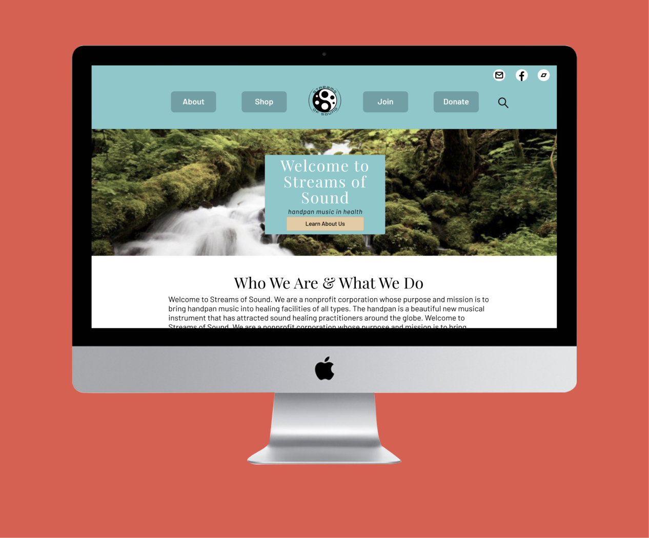
We first decided to tackle the navigation on the Streams of Sound site to include three new pages ("Join", "Donate", "About"), because users could not find any of that information readily available in previous attempts. We took suggestions from our interviews and applied them to our card-sorting and a site map; for example, users requested more information about the organization and the handpan. Additionally, we decided to group merchandise together in its own section ("Shop") to make it easier for the user to shop if they so chose.


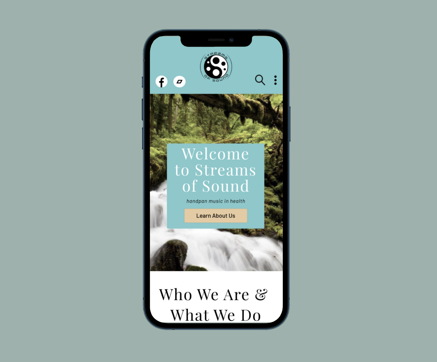
Each member of the team spent some time sketching out possibilities for the homepage, as we used it as the basis for the other pages. Ideas for the navigation bar emerged, such as placing the logo in the center with the menu on either side, adding a vertical ellipse instead of a hamburger for mobile, and removing the account login, which was unnecessary even on the current site. We wanted an interactive experience for users to be more engaged, so we put more images, video, and music in with each new iteration.


As we iterated on ideas and went from sketches to lo-fidelity wireframes, our team expanded the design to make it more interactive for users, including increasing options for donors to book one-on-one private sessions on behalf of loved ones. We also discussed the artist vetting process with Streams of Sound to ensure we were on the same page. Further along in the process, we added more spacing between sections and our style guide elements, graphics, and the proper social media that the organization uses were included. The layout did not change much between mobile compared to desktop, with the exception of the navigation menu, which moved to act as dropdown buttons.


Our group conducted six rounds of user tests, from Lo-Fi to A/B. We had each perform the same three tasks from the initial user research, namely: 1) learn about the handpan, 2) donate to the cause, and 3) join the team. Of the three tasks given, users struggled to find more information about the handpan the most. We adjusted images and copy between Lo-, Mid-, and High-Fidelity to correct this; those tested further in the process had next to no trouble on any of the tasks.

"I'd use a site if there were more payment options to donate. [...] Maybe add an arrow to the top of the join page to direct others to go below the fold."

"I might add something like a button to take users directly to the join form. Also, it feels like the homepage has too many sections to it."

"The handpan isn't prominently featured in the initial landing of the homepage; it might be nice as well to have optional background music while scrolling."
Beyond simply completing the tasks, we received feedback that made it into the coded version of the site, such as adding music to the homepage and increasing image and font sizes across the board. We also divvied up content from the homepage to simplify it for users and placed portions onto the donate and about pages, which users responded positively to in testing.


For style inspiration, we went with colors that invoked feelings of calm. Using the “Calico” and “Downy” tones from the original website, we each experimented with color swatches and compared them to make the best possible palette. Playfair Display, our header font, was chosen because of the similarity between it and the serif font currently being used on the site. Likewise, Barlow was chosen because it is easy on the eyes while reading on a screen, making it perfect for this brand. For imagery and graphics, we went with calm colors and people playing handpans, since the site currently does not showcase them.


Our final iterations included adding in a tag above the CTA on the homepage about this being a handpan organization, increasing the image sizes, changing dates to be bigger and bolder, and adding music to the coded version of the site.
While perusing the homepage, users can expect to find links to the other pages through CTAs, organizational information, upcoming events, and testimonials.
The 'About' page focuses mostly on the handpan, its history, and how it sounds. It also has links to the organization's infrequent blog posts.
Users can learn about the process of joining the Streams of Sound organization and apply on the 'Join' page. Artists can view upcoming events as well and leave reviews about working with S.O.S.
Users we talked to distrusted non profits for their lack of transparency. On the 'Donate' page, users can see where their money is going. They also have options to donate on behalf of someone or book private events.
We ultimately built three of the four pages we designed (Homepage, Join, and Donate) with HTML5, CSS, Bootstrap 4, and JavaScript. This was, by far, the most challenging portion of the project, but also the most rewarding as a functional website existed in the end. Over the course of a 13-day period, 86 commits to GitHub were made and three-quarters of our team spent time working on code. As an added bonus, spending more time on this project led to the personal decision to build out this portfolio from scratch. Benefits all around.
This walk-through includes browsing the homepage, join, and donate pages. While the they are not as responsive as would be desired, given time constraints for the projet and our lack of experience, they each turned out well. For a closer look, please click the button below to visit the site for yourself.
Shown above is the entire HTML file for the homepage and the CSS for both the navbar and the footer, using Visual Studio Code and GitHub. For a more detailed look at our code, click the link below to visit our GitHub Repo.
In summary, our team set out to expand the Streams of Sound site by improving its branding, adding pages to target musicians and donors alike, and incorporating more information about the organization on each page. With this information, Streams of Sound can add to its current site and make itself more well-known. Both the nonprofit and the instrument are relatively new to the area and, thus, are unique finds that the public will gravitate towards if they can be found.

Amidst the pandemic, Georgians lacked substantial information on where COVID-19 vaccines were being offered. This app was designed to encourage vaccine registration.

Located in a retired elementary school, the Little Five Points Community Center house local nonprofits. However, their website isn't being maintained, resulting in confused users.